|
Film criticism is the analysis and evaluation of films and the film medium. In general, it can be divided into journalistic criticism such as : newspapers, and other mass-media outlets. 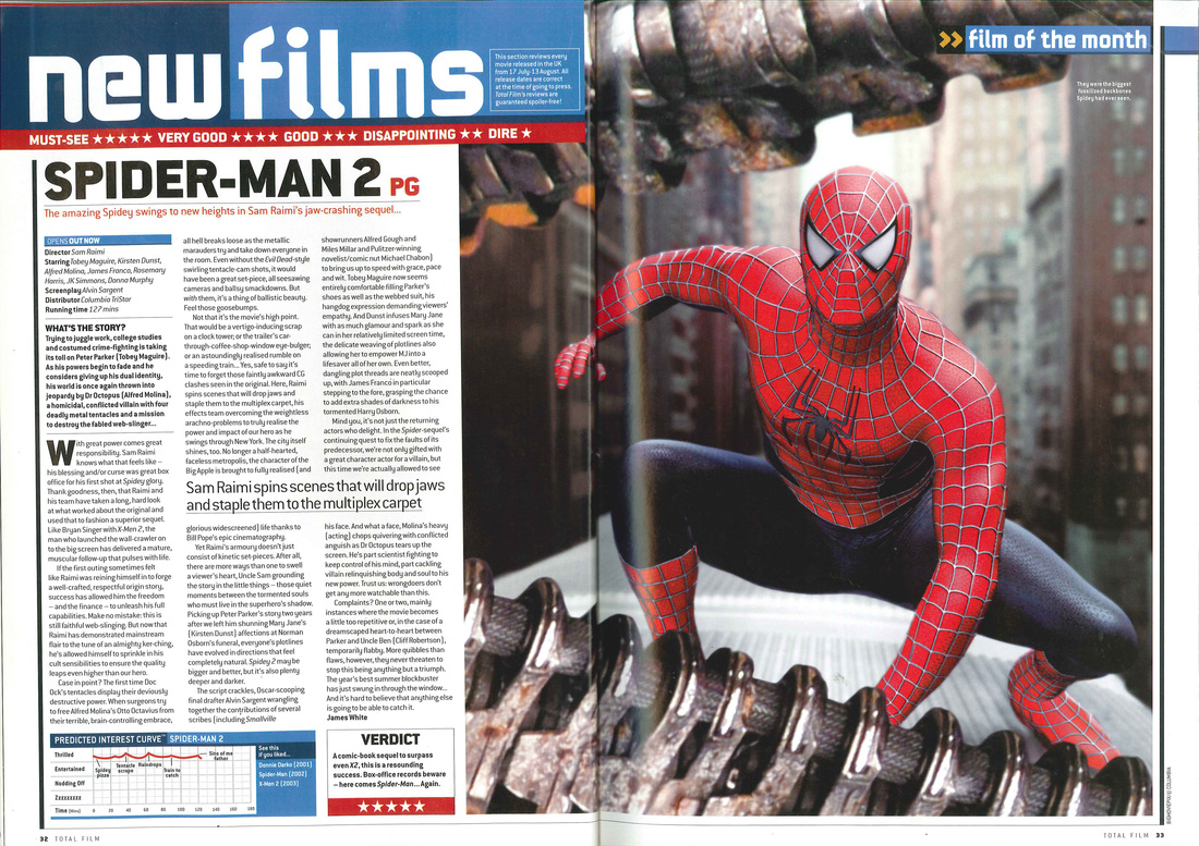 Picture: The picture is of Spiderman, a highly anticipated film that was released in 2004, is used to dominate the page in order to catch the publics' eye. It is a still image taken directly from the film so it shows how good the quality is and how the film is portrayed. The purpose of using an image is varied; to identify a famous actor as a protagonist, to give an overview of the tone of the film or even just provide a tease, essentially the purpose is to entice the audience into finding the film interesting. Titles: The colour of the title and the piercing black outlines of the mask and eyes make the title whole as it draw every aspect of the review page in. Stating the film 'Spider-Man 2' just makes sure that the public can see what film it is without having to search for it as some people do not like to read. Also, having the title 'new films' shows that the film is current and fresh, and ensures that the public know that the film is newly released in cinema's so that people can watch it. Colour: Using the colours blue and red, dotted all over the page, links together the whole theme of Spider-Man and the colour of his suit and therefore this startegy of advertising compliments the marketing team that have carefully put this review page together. It shows that they have put lots of work into it and have shown their skills of how to link it all together. Ratings: Showing the star ratings 'must-see (5*)' automatically catches the public's eye, not only because of the symbols used and the colours, but the words used as they are shown positively in order to attract people to pay to watch the film. For obvious reasons, the company will not make money from this magazine if the article is shared online, but the word will have spread through mass media interactions. 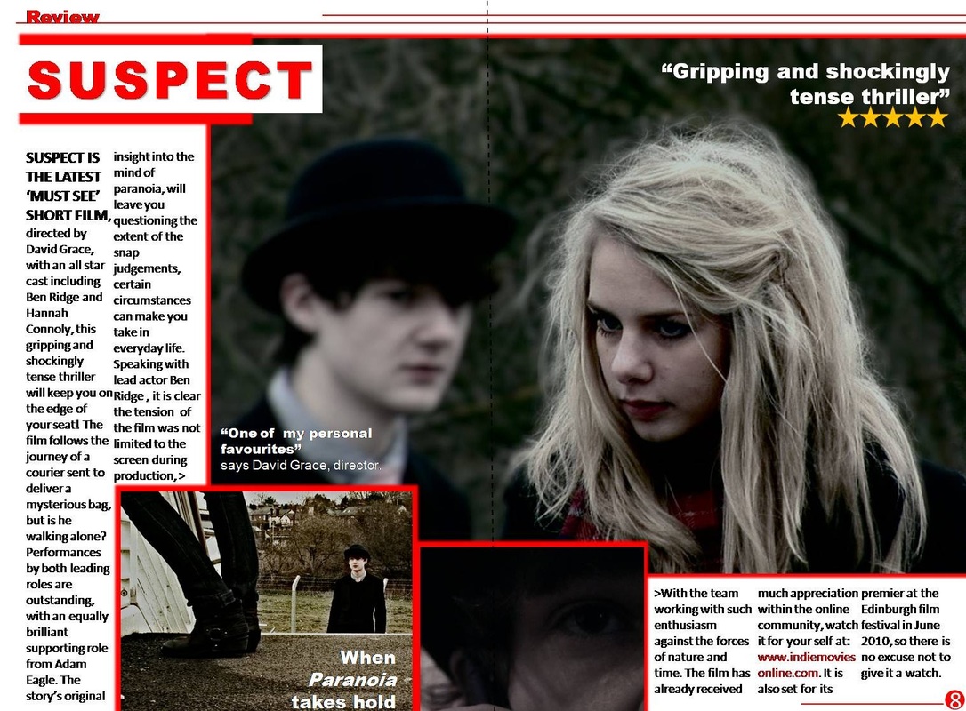 This is an example of an A2 piece of coursework. Although it is not linked to superhero's, I thought it would be good to analyse an existing A2 review page in order to understand the elements that are needed to put into this ancillary text.
Pictures: The first picture involves a woman and a man that have a 'concerned' look on their face, and it makes the public wonder what they are looking at and why. Also, as the man is blurred out in the background, it shows that the girl is the main focus of the short film and makes you identify more with her. The second picture shows a high angle shoot of a woman's boots and a man's head, which portrays that the man is less important to her, much like the first picture. Titles: The main title is very bold and has used the colours red and white. This foreshadows the short film because, the white could symbolise a ghost or spirits, or heaven, and the red suggests danger, blood and death which links to the name of the film, Suspects. Colour: The colour red is significantly used throughout the whole review page, it is highlighted the most throughout the title and to box in the writing and photo's. This is because it draws more attention to the writing which tells you about the film and themes. Also, it is also shown throughout the woman's scarf, which connotes that she could be involved in, or is the reason for the crime, death or blood, which is very mysterious and makes the public want to see it. Ratings: There are two opinions and one rating on this film which shows that it has been released but it has not spread very wide. Using the words 'gripping, tense, and shockingly' automatically entices the public to watch the film as those words are used usually to describe thriller films and films that have twists or murder mysteries in them. The other opinion/rating is from the 'director' himself, who openly says how great the film is which influences the public to see it because it empowers the story line of the film and makes them believe that it is great, because the director has said so.
1 Comment
|
